Celebrating Innovation: EduCyber Launches WSArchitect.com and MobileWrenchFleet.com

We are thrilled to announce the launch of two cutting-edge sites that set a high standard for design: WSArchitect.com and MobileWrenchFleet.com.

WSArchitect.com: Moving from a dated website to a contemporary site that shows the breadth of their work from small projects to large, from feasibility studies and planning to interior architecture and building architecture.

The prior home page had a navigation menu, a logo and sliding banner that didn’t link to anywhere.

Before View
Before View

The new home page at wsarchitect.com has a new logo that actually builds before your eyes, a full page slider of their work and each slide links deeper into the site and has a call to action and then below that showcases more about their philosophy of building relationships, their projects, their team, and shows how they are engaged in the business community.

This Is The Newly Designed Site
This is the newly designed site

We are so pleased to have been able to work with – and continue to work with – the wonderful team at Wong Strauch  Architects. If you are in need of an architectural firm, give them a shout.

Following close on the heels of the launch of that site in late 2023, was the launch of mobilewrenchfleet.com. Working closely with Mobile Wrench Fleet, we were able to modernize and streamline their site, giving it some very engaging movement, writing a lot of new content and making the site much friendlier for search engines.Screenshot 2024 01 12 At 15 55 06 Mobile Wrench – Commercial Fleet Services Denver

This new site shows the range of services they offer, the locations they service and who utilizes their services. The site structure dovetails into all of their digital marketing efforts, especially the paid search campaigns that we are running for them.

Here’s a quote from the company president:
Work with them on overhauling our website and optimizing our PPC marketing. Website exceeded all expectation and was launched in a timely manner. The team worked and communicated in a seamless manner to get it done. PPC has cut in half the average cost of acquisition and enhanced follow through. EduCyber is the real deal.

If you are ready for a website upgrade, give EduCyber a call at 303-268-2245 ext. 4.

SHARE THIS:

EduCyber Launches Two Websites

Last year EduCyber began working with Community Table to modernize and streamline their website. Earlier this year we launched that new site and continue to work with them as their organization grows and changes.

Create unique icons to organize services

As a part of the project, we created some specific iconography to help navigate through the site and provide a sense of place:

Iconography

Use existing tools for better communication

We also made sure it was setup with Google translate to help their key constituencies, no matter their native language, better navigate through the site.

Access the most searched for content in seconds

Part of the process of streamlining the site included having two prominent buttons, one for directions and hours that shows that in a drop down from anywhere on the site and a donate button to quickly help donors get to the right place.

If you or your organization needs to reposition yourself to better serve your people and better communicate your message, give EduCyber a call.

View the site

Website for global audiences

We serve far more than that front range of Colorado. With clients in Illinois, Iowa, Nebraska and more. Just recently we launched a new website for Concordia Lutheran School of Omaha, a K-12 private school in Omaha Nebraska.

Concordia Omaha

Are you ready to redo your site?

Let’s Talk

SHARE THIS:

EduCyber Launches New Website for Community Table an Arvada, Colorado Non-Profit
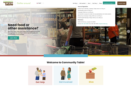
Arvada, Colorado, May 5, 2023 – EduCyber, a leading web development firm, is proud to announce the launch of a new website for Community Table, a non-profit organization dedicated to fighting hunger in Jefferson County. The new website, which can be found at www.cotable.org, is designed to enhance the organization’s online presence, improve user experience, and increase the community’s involvement in their mission.

The website features a modern design that is easy to navigate and provides visitors with information on how to donate, volunteer, and get involved with Community Table’s initiatives. Visitors can learn about the different programs and initiatives that Community Table has implemented to fight hunger in the community, as well as the impact of their donations and support.

“We are excited to have partnered with Community Table to build a new website that helps them further their mission of fighting hunger in the community,” said Brian DeLaet, CEO of EduCyber. “Our team is proud to have developed a website that will make it easier for people to donate, volunteer, and get involved with their important work.”

Community Table encourages everyone to visit their new website to learn more about how they can get involved and support the fight against hunger in Jefferson County Colorado. For more information, please contact info@cotable.org or 303-424-6685.

About EduCyber: EduCyber is a leading web development firm that has been providing high-quality web design and development services to businesses and non-profit organizations since 1998. The company’s team of experienced developers, designers, and marketers works closely with clients to deliver customized solutions that meet their specific needs. For more information, please visit ww.educyber.com or call 303-268-2245.

SHARE THIS:

The Road to Good Intentions is Paved with What?

OK, that might not be how that saying goes but, unlike the real world where intent and outcome are often very different, in the world of search and in building an excellent website, understanding intent is critical to getting it right.

If, for example, someone searches for “eagles”, Google has to try to determine the intention of the searcher. Are they looking for the football team? Are they looking to place a bet on the team? Have they seen an eagle flying around their neighborhood and are trying to identify it? Are they a student writing an essay on an endangered species? All of these could be the intent of the searcher.

So what does Google do? Well, in this week before football’s biggest game, they serve lots of results around the Philadelphia Eagles. But they also provide other options in case you were searching for “eagles birds” or perhaps the rock band, or the Colorado hockey team (an affiliate of the Avs).

You should think of your website in the same way. When someone gets to your site, what is their intent? Are they trying to find out how to contact you (don’t make it difficult)? Perhaps they were referred to you by a friend or colleague. Is it clear from the outset what you do and what services you offer?

Taking that a step further, lets remember that not everyone comes “through the front door” of your website (the landing page). If someone clicks on a Google search result to get to your site, they may very well have come in through a “side door” to a page within your site. In that case, in addition to providing the information the person wanted, you should have enticements to dig deeper, learn more, engage in the site.

This part becomes more complicated. If the page they landed on gave them the information they wanted, they may be done. But most of us want the visitor to stay on the site, to find it so engaging they just stay and keep clicking – or better yet to call / fill out a form / buy. For this part you need to think more about what all users may want when they come to your site.

And not everyone, unfortunately, comes to your site looking for what you are offering. But that doesn’t mean they might not stick around. What can you do to further engage them? Here are a few things you may want to consider:

  • Video – a short video that captures the visitor’s attention even before clicking on play
  • Testimonial – written or video is captivating because it is someone else sharing their experience with you / your company
  • A button that has some kind of unique offer – that will take them to another page and provide more information

Not sure what might be right for your site? We’d be happy to have a conversation with you. Give us a call

SHARE THIS:

Finishing Strong

Sometime in the first or second week of November, many business people slowly begin to checkout. It’s time for Thanksgiving and then Christmas and then New Years. It’s not time to close new deals or even to push to the finish on existing deals or projects.

But that is really just an excellent way to waste 1/10th of the year.

If it seems like your prospects or projects are beginning to taper off, here are five ways you can bolster your year and finish strong

  1. Review your website. Things change over the course of a year. Are the offerings / services / products displayed all still accurate? Anything new to add? What about personnel?
  2. Review your calls to action. Whether it is for your website or your social media presence or your online ads, are the calls to action generating action? If not, determine if you need more activity or better calls to action (or both).
  3. Check your traffic. If you have an established conversion rate (XX number of visitors generates X number of leads), is your traffic volume headed in the right direction? If you don’t know or don’t have a conversion rate, then you probably need to revisit #2 above. You should be able to measure visitors on your website, interactions on social media and how your brand and keyword phrases perform in search.
  4. Refresh your digital marketing goals. Social media, for example, can be a powerful tool for connecting with prospects but you need to have a clear plan. And remember, social media marketing is not a popularity contest. It isn’t the number of fans or followers but the quality of the connections and the way you interact.
  5. Hire a digital marketing firm to help you out. Sounds like a self-serving step but pause and consider. What are you good at? What do you enjoy doing in your business? If managing your website and your digital marketing is not high on the list, then why not turn to the pros who do enjoy it and are good at it?

Whether you are struggling to hold the line, growing like crazy or somewhere in-between, staying engaged all the way to the end of the year will yield benefits both for 2021 and to launch 2022 off to a strong start.

SHARE THIS:

FIVE (Digital) Steps to Reopening Your Business

110613320 S
FIVE (Digital) Steps to Reopening Your Business 11

Join EduCyber as we walk through the FIVE (Digital) steps you’ll need to go through as you re-open your business. You’ll see how you can take the next steps with more confidence and figure out how to integrate the New Normal into your business routine.

You will learn:
• How to prepare your business as you re-open your door for your customers
• What risks should you consider and how to avoid it
• New-normal – Why ‘We’ve always done it this way’ doesn’t work anymore

Join us on Wednesday, May 7 at 3:30 – Register at https://us02web.zoom.us/meeting/register/tZcvde6sqTgjHNP1L70p4JCP7IAdjJqZFBXb

SHARE THIS:

Leveraging Your Web Site During the COVID-19 Crisis

Web Site Review1
Leveraging Your Web Site During the COVID-19 Crisis 13

So you are unexpectedly forced into downtime. Can’t go to the office. Can’t go to the restaurant. Can’t go to the theater. Set aside the frustration for a moment. What can you do?

Remember way back when you were too busy to take the time to work on your site (last week)?

Now you have the time for you and your staff to revisit your website. You might be surprised. Earlier today we met with a businessman who had recently changed to a whole new website with a new URL. As we went through his site and his listings, we discovered that many of his social media and external sites linked to the previous site or to the previous email.

What things should you look for?

Basic five

  1. Is your logo and tag line current and up-to-date across all media?
  2. Is your name consistent on every page and on all your social media?
  3. Check your physical address. One thing search engines need is the same address where even “Ave.” and “Ave” can be seen differently. Make sure your address is absolutely identical. If you belong to any trade associations or chambers, check them as well.
  4. Look at your site on a phone. Does it look right on every page? Does the mobile responsive part work as expected?
  5. Review your color scheme. Does your site follow the scheme properly? Are all the colors matching your approved standards?

Intermediate five

  1. Request testimonials
  2. Request reviews
  3. Are your forms all working? Is there a next step after a form is filled out?
  4. Is the contact information accurate and up-to-date?
  5. Check for bad reviews on social – Facebook, Yelp, Google, etc.

Advanced five

  1. Are there any pages or content on your site that no longer applies to what you do?
  2. Are all of the images appearing properly? Do you need any new or different photos?
  3. Have you added any new services or products that are not yet on the site?
  4. Are your blog and social media profiles current and accurate?
  5. Is there a clear path or next step on each page?

Need help? We are available for phone or online support. Contact Brian at 303-268-2245 ext 4 or visit https://www.educyber.com/contact-us/.

We are the power behind your website.

SHARE THIS:

Misguided Marketing

Over the course of the last several years, we have had many customers come to us asking for Search Engine Optimization. We do SEO (and we do it well) so we are happy to accommodate.

Are Your Marketing Goals Misguided?But as a part of our marketing assistance, we seek to understand the goals of the SEO program. On a few occasions the customer’s goal has not been to get a higher ranking with the search engines. Those conversations go something like this:

Customer: I would like you to do SEO for my site.
EduCyber: Sure thing, let’s take a look at your numbers. First, what is your conversion rate for your web site?
C:            ???
E:            How many leads are you generating from your site on a daily, weekly, monthly or even quarterly basis?
C:            I’m not.
E:            So if we get you ranked in the top ten for all of your keywords and you are still at a conversion rate of zero, will you be happy?
C:            Of course not!
E:            So let’s look at what you want to accomplish.
C:            I want the phone to ring!
E:            Ah, we can help with that.

And in many cases what we do is first tweak or in some cases redo the site to clarify and simply the Call To Action (CTA). Once we’ve done that we can establish a conversion rate. Once the conversion rate is established, then we can look at whether SEO, Pay Per Click, Social Media or some combination of those is the appropriate solution in order to get more business.

Are you wondering if you might be practicing misguided marketing? Some of the comments we hear from folks include:

  • We tried social media, it didn’t work.
  • I don’t get any feedback from my SEO firm.
  • I get all kinds of reports from them but I don’t understand any of them.
  • We’re paying a lot of money but not getting any tangible results.
  • I’m told we rank high but the phone isn’t ringing
  • I’m paying for clicks and I see the reports but no one is contacting us.

If you find yourself saying or thinking these, give us a call at 303-268-2245 ext 4 or visit https://www.educyber.com/request-free-call/ to schedule your no pressure evaluation of your site and goals.

SHARE THIS:

The 5 Requirements for a Powerful Manufacturing Website

102400242 S
The 5 Requirements for a Powerful Manufacturing Website 16

Powerful Manufacturing websites are a niche that make them different from other kinds of websites. They need to display their products in such a way that searchers can find and visit the page of the specific product they want. They need to be searchable. But they also need to show the quality of the product, of the people making the product and even the process and standards that go into creating the product.

Here are the five requirements for a powerful manufacturing website that actually connects with customers and potential customers:

  1. It needs to have a product database. Whether you actually sell directly online or just show the products, the database needs to function like an ecommerce site where you can view individual product pages, get the specs, perhaps even see reviews and get support for the product.
    All of this can and should be done through a product database so you can dynamically display different products – by category, most popular, possibly even by price or SKU.
  2. The design of the site must be compelling. Unless you are a big, nationally known brand, you want to engage visitors right from the start on what they need. The first step of that process is to confirm for them that you are a legitimate source for the product they need.
    Compelling images of your products, perhaps being created or finished are an excellent way to show your workmanship, display what you actually do and impress with your quality work.
      1. It needs to have a product database. Whether you actually sell directly online or just show the products, the database needs to function like an ecommerce site where you can view individual product pages, get the specs, perhaps even see reviews and get support for the product.
      2. All of this can and should be done through a product database so you can dynamically display different products – by category, most popular, possibly even by price or SKU.
      3. The design of the site must be compelling. Unless you are a big, nationally known brand, you want to engage visitors right from the start on what they need. The first step of that process is to confirm for them that you are a legitimate source for the product they need.
      4. Compelling images of your products, perhaps being created or finished are an excellent way to show your workmanship, display what you actually do and impress with your quality work.
      5. Finally you need to have clear and effective calls to action. One of the biggest downfalls for manufacturing websites is displaying information without moving folks to the next step. By having a good next step on each page of your site, you will not only engage your web visitors but convert them into customers.

      Does your site do all five of these? If not, give EduCyber a call. We can tweak your existing site or design a whole new site to help you grow.

SHARE THIS:

The Ugly Baby

Ugly Website

You’ve probably seen this – a parent who is so proud of their beautiful baby that the rest of the world is afraid to tell them the truth.

The same thing often happens with web sites. Especially websites put together in house. “We ‘birthed’ this site and it is gorgeous” is the mentality that folks have.

That is why it is so important to have others try the site. If possible you want to have impartial 3rd party folks try the site. We have had numerous folks come to us wanting to help make their “beautiful baby” better by tweaking it.

When it comes to websites, it is sometimes possible to tweak a good site to make it great. But it is never possible to tweak an ugly site to make it good.

What do I mean by an ugly site? Here are the most common symptoms:

20622187 S
  1. No call to action – just a lot of information but no way to act on it.

  2. Too many calls to action – we’ve seen sites with dozens of calls to action – sort of like walking into a crowded room and having everyone calling your name at once – makes you turn around and leave.

  3. Graphics that distract visitors from the call to action. If your call to action is on the left and you have pictures of people in the middle, looking to the right, visitors won’t look left, they’ll look right.

  4. Too much movement. Having an engaging website is to be desired. If you endeavor to engage by several different sections having movement, it is just distracting and leaves visitors lost.

  5. Unchanged in ten or more years. Yes, we regularly have clients come to us who have not updated their site in that long. And yes, by 2019 standards, they are ugly.

  6. Not responsive. Not unresponsive, just not responding to mobile devices. If your site doesn’t conform to responsive standards, it will look ugly on a phone. Just today – in July of 2019 – I came across a site that is not responsive. It just shows a much smaller version of itself. Drop down menus don’t work, hard to click on links because they’re too close together – just a mess.

If you have an ugly site though, there is a cure. We can help. We make beautiful web sites. And you will love the Return on Investment you get because that is how we design every site – with ROI in mind. Call 303-268-2245 ext 4 to turn your ugly baby into an integral part of your business.

SHARE THIS:

We are proud members of many community organizations and chambers. See Our Community Involvement.

©1998-2024 EduCyber - All rights reserved. | 4251 Kipling Street, Suite 340 Wheat Ridge, CO 80033 USA | info@educyber.com