Staying Ahead in 2024: 5 SEO Trends To Pay Attention To

Mobile Seo
SEO Trends for 2024

As we navigate the digital landscape, staying ahead in SEO is paramount.  Here are five trends reshaping the SEO landscape for 2024:

  1. Voice Search Optimization: Voice-activated searches are on the rise. Tailor your content to conversational queries for a seamless user experience. I personally do most of my searches via voice these days. One of the things that means is that you can use longer phrases – it’s much easier and faster to speak than to type. Think through how you would search for your services in sentences and phrases instead of key words.
  2. Core Web Vitals Dominance: Google loves speed! Basically this refers to how long it takes for the page to load. But there is a lot more technical calculations behind it. Prioritize Core Web Vitals for improved user satisfaction and better search rankings. Check your site’s page load timing – our favorite resource is gtmetrix.com for that. One of the key factors in this is Largest Contentful Paint (LCP). A way to conceptualize this is “How long does it take from the time a visitor goes to your site before they can begin to interact with it?” Interact could be scrolling, clicking, or just viewing the content.
  3. AI-Driven Strategies: Leverage Artificial Intelligence for smarter content creation, personalized user experiences, and predictive analytics. The use of AI can speed up your processes, especially for content creation. And the more content rich your site is, the more search engines love it. Just remember to edit / make any generated content your own.
  4. Mobile-First Indexing: With the majority of users on mobile, ensure your website is mobile-friendly for optimal indexing and user engagement. Sure it needs to load fast but also make sure it loads right and that the content you most want users (and search engines) to see is at or near the top of the page.
  5. Collaborative Content: Partner with influencers and industry leaders for collaborative content creation, boosting credibility and expanding reach. Since the beginning of advertising, influencers have played a prominent role in marketing, and that is what SEO is. That’s why actors, musicians, athletes and others are asked to endorse products. But even in the B2B realm you can leverage partnerships and connections to industry leaders to get a boost for your site.

Why Embrace These Trends?

  • Stay Competitive: Stay ahead of competitors with forward-thinking SEO strategies.
  • Enhance User Experience: Prioritize user satisfaction with faster, more accessible websites.
  • Future-Proof Your Brand: Embrace evolving technologies to future-proof your digital presence.

Ready to Elevate Your SEO Game?

EduCyber is here to guide you through these trends, ensuring your brand remains at the forefront of SEO excellence. Let’s shape the future of your digital presence together!

Call or contact us today.

#SEO2024 #DigitalMarketing #SEOInnovation

SHARE THIS:

EduCyber Launches Two Websites

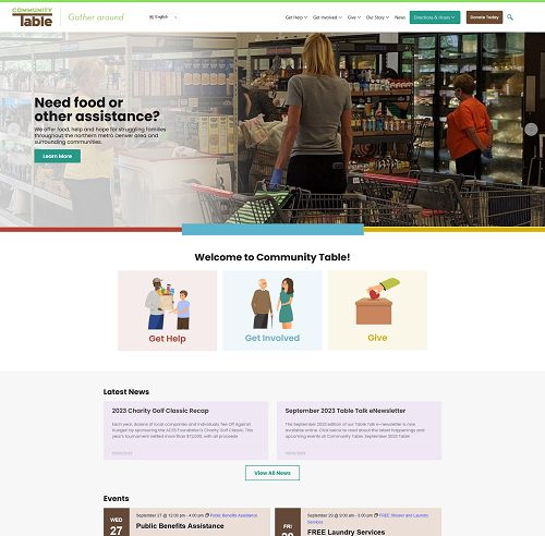
Last year EduCyber began working with Community Table to modernize and streamline their website. Earlier this year we launched that new site and continue to work with them as their organization grows and changes.

Create unique icons to organize services

As a part of the project, we created some specific iconography to help navigate through the site and provide a sense of place:

Iconography

Use existing tools for better communication

We also made sure it was setup with Google translate to help their key constituencies, no matter their native language, better navigate through the site.

Access the most searched for content in seconds

Part of the process of streamlining the site included having two prominent buttons, one for directions and hours that shows that in a drop down from anywhere on the site and a donate button to quickly help donors get to the right place.

If you or your organization needs to reposition yourself to better serve your people and better communicate your message, give EduCyber a call.

View the site

Website for global audiences

We serve far more than that front range of Colorado. With clients in Illinois, Iowa, Nebraska and more. Just recently we launched a new website for Concordia Lutheran School of Omaha, a K-12 private school in Omaha Nebraska.

Concordia Omaha

Are you ready to redo your site?

Let’s Talk

SHARE THIS:

EduCyber Launches New Website for Community Table an Arvada, Colorado Non-Profit
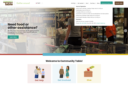
Arvada, Colorado, May 5, 2023 – EduCyber, a leading web development firm, is proud to announce the launch of a new website for Community Table, a non-profit organization dedicated to fighting hunger in Jefferson County. The new website, which can be found at www.cotable.org, is designed to enhance the organization’s online presence, improve user experience, and increase the community’s involvement in their mission.

The website features a modern design that is easy to navigate and provides visitors with information on how to donate, volunteer, and get involved with Community Table’s initiatives. Visitors can learn about the different programs and initiatives that Community Table has implemented to fight hunger in the community, as well as the impact of their donations and support.

“We are excited to have partnered with Community Table to build a new website that helps them further their mission of fighting hunger in the community,” said Brian DeLaet, CEO of EduCyber. “Our team is proud to have developed a website that will make it easier for people to donate, volunteer, and get involved with their important work.”

Community Table encourages everyone to visit their new website to learn more about how they can get involved and support the fight against hunger in Jefferson County Colorado. For more information, please contact info@cotable.org or 303-424-6685.

About EduCyber: EduCyber is a leading web development firm that has been providing high-quality web design and development services to businesses and non-profit organizations since 1998. The company’s team of experienced developers, designers, and marketers works closely with clients to deliver customized solutions that meet their specific needs. For more information, please visit ww.educyber.com or call 303-268-2245.

SHARE THIS:

The Ugly Baby

Ugly Website

You’ve probably seen this – a parent who is so proud of their beautiful baby that the rest of the world is afraid to tell them the truth.

The same thing often happens with web sites. Especially websites put together in house. “We ‘birthed’ this site and it is gorgeous” is the mentality that folks have.

That is why it is so important to have others try the site. If possible you want to have impartial 3rd party folks try the site. We have had numerous folks come to us wanting to help make their “beautiful baby” better by tweaking it.

When it comes to websites, it is sometimes possible to tweak a good site to make it great. But it is never possible to tweak an ugly site to make it good.

What do I mean by an ugly site? Here are the most common symptoms:

20622187 S
  1. No call to action – just a lot of information but no way to act on it.

  2. Too many calls to action – we’ve seen sites with dozens of calls to action – sort of like walking into a crowded room and having everyone calling your name at once – makes you turn around and leave.

  3. Graphics that distract visitors from the call to action. If your call to action is on the left and you have pictures of people in the middle, looking to the right, visitors won’t look left, they’ll look right.

  4. Too much movement. Having an engaging website is to be desired. If you endeavor to engage by several different sections having movement, it is just distracting and leaves visitors lost.

  5. Unchanged in ten or more years. Yes, we regularly have clients come to us who have not updated their site in that long. And yes, by 2019 standards, they are ugly.

  6. Not responsive. Not unresponsive, just not responding to mobile devices. If your site doesn’t conform to responsive standards, it will look ugly on a phone. Just today – in July of 2019 – I came across a site that is not responsive. It just shows a much smaller version of itself. Drop down menus don’t work, hard to click on links because they’re too close together – just a mess.

If you have an ugly site though, there is a cure. We can help. We make beautiful web sites. And you will love the Return on Investment you get because that is how we design every site – with ROI in mind. Call 303-268-2245 ext 4 to turn your ugly baby into an integral part of your business.

SHARE THIS:

Google’s Suite of Tools – Is There a Cost?

We recently attended an event where Google flew in a trainer to present on Google My Business, Optimizing your website for Google and Pay Per Click campaigns. It was a very good presentation from a polished speaker but the mantra we heard again and again is “This is all free.”

64635315 S

Free is an interesting concept. After 90 minutes of this training, many people were just ready to get started. Getting your business verified will take anywhere from 10 minutes to two hours. Building out your profile and putting the right information in takes careful planning if you want to really grow your business.

Optimizing your website for search engines is free, we learned. But of course, if you do all of this “for free” you will probably wonder if you did it right. You might not know how to track the results. Ah, but we also learned that Google Analytics (GA) is a free tool. EduCyber sets up GA for our hosting clients if they don’t already have it. And we walk them through, on a regular basis the maze of finding the data that means something to them and then helping them interpret what that data means.

The point is, there are many things you can do, and indeed do them

for free, as long as your time is free. But if your time is valuable, if you make more money servicing your clients by producing the goods or services they want, then maybe it isn’t really free.

If you need help with your “Google My Business” profile, with optimizing your site, for measuring the success of optimization, or with a paid search campaign, we can help. This is what we do day in and day out to help our customers get the most of their website while being able to focus on what they do best. Give us a call at 303-268-2245 ext 4 to get help today.

SHARE THIS:

The Problem with Content

On the Internet, content is king.  If you want to be ranked in the search engines, the best thing you can do is put original content on your website.

45151544 S

We often have existing or potential customers get very enthusiastic about generating content for their site as we extoll the virtues of doing so. And they often follow their content generation plan very religiously . . .  for at least a week or two. But then other bright shiny objects grab their attention and they wander away from their schedule. Sometimes they never return.

Everyone can write, right? Sure we aren’t all the best spellers or best grammaticians. But who knows your business better than you? So it can’t be that hard to write a few lines of content. Or maybe you love to write. You can easily fill page after page about what you do.

But is your content web-ready? Is it optimized for search? Have you considered the placement of key words and key word phrases? There are a myriad of web specific things to understand and implement into your web site content.

  • Is it in a web-friendly font?
  • Is it broken up into digestible chunks?
  • Do longer paragraphs have visual cues to help readers quickly grasp the main points?
  • Have you used headings?
  • Have you used subheadings?
  • What is the call to action in your text?
  • How much information is too much?
  • Will your content look good on mobile devices?
  • How much information should you include so search engines can properly index your page?
  • Are there any visuals you can use along with your text to illustrate key points?
  • Did you actually use any of your key words or keyword phrases?
  • Does your keyword phrase appear in the first paragraph of content?
  • And the list goes on . . .

And what happens if you don’t consider any of these questions?

Most likely your site will be lower in the search rankings than you would like. Most likely you will attract fewer visitors. Most likely the visitors that you do attract will not be as meaningfully engaged as you would like. Most likely your site won’t perform for you. It won’t help you grow and attract new business. It won’t help you engage existing customers. And then you’ll blame your web design team for building a poor site.

Don’t get in trouble with your content. Instead, turn to someone who gets content and understands how the web works. If you choose not to have us do it, choose someone who is well-qualified. If you do choose to work with us, contact us today to get started.


SHARE THIS:

Little Data

In the Internet world, Big Data is a big buzz word. With the right tools huge volumes of data can be digested, analyzed, and summarized with amazing speed. Technology like this is what is driving technical inroads in an array of industries from understanding the human genome to making digital currency like Bitcoin to understanding shopping patterns of given demographic segments.

But what about Little Data? Your little website. It may not be asLittle Data big as Facebook or have as many visitors as Amazon or Walmart but there is still an incredible amount of data that is available from your slice of the Internet. So how can you turn little data into a big benefit?

  • Email tracking
    Every mass emailer (aWeber, iContact, MailChimp, Robly , etc) has a variety of tools that can help you track the effectiveness of your email campaigns. Some of the key metrics you should look for include Total Opens, Unique Opens, Unique Clicks, Click to Open Rate, and Device type (responsive)
  • Social Media tracking
    You can track just about everything with social media. Some of the key things that will be of value to you though include: how many visitors to your website you got from social media, how many friends, followers or fans you have on your profile or your company profile, how many shares or views your posts or articles got and so much more
  • Site analytics (Google Analytics or some other analytics package)
    What started off as a way to track the number of visitors has now become a very sophisticated way to track any number of activities both on your website and prior to arriving – and even after leaving for that matter. You can learn what your visitors do, what devices they use, how fast your site is, create funnels and track actions
  • Call Tracking
    There are a variety of services that you can set up that will help you to track where your calls are coming from – from a specific landing page for a specific campaign, from a social media campaign or even from a print campaign
  • Campaign tracking (with specific landing pages or domains)
    You can create custom urls or even custom domains to run and track specific campaigns. Running an end of the year campaign to boost sales? You could have a special url (sometimes called a purl for personalized url) like http:// <your-domain>/christmas and track all the clicks to that link.

So even with Little Data (the data that you have available to you on your little slice of the internet) you can harness the power of Big Data and get a much clearer picture of what is actually happening. You can then design a specific plan to get that traffic to take the action(s) that you want them to – whether it be make a purchase, fill out a form, make a phone call, sign up for a seminar or some other factor that is part of your conversion process.

Need help figuring out how to do this for your site? Call us at 303-268-2245 ext 4.


SHARE THIS:

Is Page Speed Important?

Not long ago I wrote an article on Page Speed. Since then, page speed has continued to climb in importance.  How Google’s algorithm for ranking pages works is the secret sauce that makes them who they are. But we do know that pages that load fast are moving up in importance in the algorithm.

Page SpeedSo what can be done?

There are a few things you can do that can have a dramatic impact on your web page loading time.

  • Optimize your images. Nearly every site we test has images that can be better optimized for display on the web. Remember, more and more people are using mobile devices as their sole connection to the internet. So having big images will slow them down and often not display as well as images that are optimized for mobile.
  • Tell your site to use browser caching. While there are different ways of doing this from the technical – like manually editing your .htaccess file – to much simpler – like installing  a caching plugin, this one change can score you points with page speed and ultimately provide a better user experience.
  • Make sure you are displaying the proper size of images. Together with point # 1, you can become the ace of images by making sure that you are displaying an image at 300 pixels wide by 400 pixels tall, that your image is 300 pixels X 400 pixels. If you’re loading an image that is 600 X 800 and then displaying it at 300 X 400, you can get a 50% reduction by resizing that image. This is pretty easy to do. I sometimes do this in Windows using the Paint program and it can be done in seconds, not minutes.
  • Deliver your files with compression. Windows users will be familiar with zipped files. That is pretty much the same concept here. Telling your web server to deliver files using gzip usually improves your page speed a bit.

Why do you want to have a fast site? There are two main reasons. First comes the user experience. If people visiting your site are met with spinning icons as your page slowly loads, they’ll likely feel like they’re spinning their wheels and go elsewhere.  Second is search engines. Having a fast-loading web page is one of the “search signals”. A search signal is a factor that Google or other search engine uses to determine how to rank a page for different key words.  While it is but one of many signals, since it also fits with a better user experience, we HIGHLY recommend optimizing your site for speed using one of the tools in the previous article

SHARE THIS:

Page Speed: How Fast is Your Site?

Does your site load on people’s computers quickly? If it doesn’t, does it matter?

Fast1The answers to those two questions are “It better be fast” and “It absolutely matters”.   There are two main reasons:

  1. User Interface. If users are waiting and watching the spinning circle or other indicators that the page is loading but it hasn’t finished, they leave.
  2. Google rewards fast web sites with better, higher rankings. Not just Google of course but since Google accounts for 75% of searches, we’ll just say “Google”.

So what can you do to tell if your site is fast? We have two answers for that as well:

  1. Google actually tells you how fast your site is and gives tips on how to make it faster. Visit https://developers.google.com/speed/pagespeed/insights/ and enter your domain and see what Google says about your site.  It is a good idea to visit on a regular basis – monthly or quarterly to make sure that nothing has changed either on your site or how Google views your site.
  2. There is another great, free tool https://gtmetrix.com/ that lets you see the speed and uses several other tools to help you understand what is happening on your web page. One of the biggest issues we see with this tool is that images aren’t optimized well. The cool part of it is the tool provides you with the optimized version of the image in question. No more trying to guess what it means.

So take some time to check out your website today. Use both of the tools above to check not just the homepage but also other key pages on your site. Just because you get the home page to load quickly doesn’t automatically mean other pages will.

Just as I wrote this article I found that one of the plugins we were using had “gone rogue” and was lowering our score for page speed. That plugin is gone and we’re back to fast loading pages.

The tools will help you measure the speed and once the tools say your pages are loading fast, you can go back and work through your site from a customer perspective and verify that they are indeed going smoothly and quickly.

And of course, if you would like assistance in speeding up your page or pages, call us at 303-268-2245 ext 4 and we’ll get the ball rolling.

SHARE THIS:

Responsive Web Design: An Evolving Trend

Actually Responsive Web Design is not a trend of any kind – evolving or otherwise. It is a standard practice for web sites today.

The challenge the designers face is making their site look good on every device imaginable, from a 42 inch monitor to an iPad to a mobile phone like a Samsung 7 or the latest iPhone. That is a tall order.

Is Responsive Web Design A Requirement?

There are several key things designers use, chief of which is the ViewPort meta tag to define what how the page should respond to different devices. But this article is not about the arcane things developers and designers do.

What do you – a business owner or manager need to know?

Responsive Web Design

  • You shouldn’t have to ask for responsive design. It has been a few years since some of the basic rules were laid down. But still verify that a new or existing site is or will be responsive. And take Ronald Reagan’s advice – Trust but Verify. Use family and friend’s (or coworker’s) devices to view your site to make sure it looks right.
  • Responsive doesn’t just happen, it can be planned. For example, a restaurant web site may display its succulent fare on the front page and even have the menu right on the front page. But the mobile display should make location and phone number prominent. If you’re out and about and looking for a restaurant, you either want to know where it is or call to make reservations.
  • What happens to the menu? Believe it or not it is called a hamburger menu – it looks sort of like a bun on top of a burger on top of a bun. While it is fairly ubiquitous, tests show that instead of those three little lines, putting the word MENU in the same place in the same size gets far more clicks. I know what a navigation menu is. I might not know, or notice, those three little lines. Try it with your site and see what happens. The key is to be user-friendly.
  • Many sites (and business owners) are taking a mobile-first attitude. This turns on its head the idea of building a full desktop viewable site and then determining how it should look on mobile. First you design the site so it will rock the mobile look and then scale it up from there to determine how it will look on tablets and desktops.
  • A basic tenet of web design that has become even more important with the growth of responsive web design is to have a clean design that focuses the user on key actions. Remove all distractions from what the goal of your site is. If I have to stop to think about whether to click a link going to a vendor’s site or click the buy now button, you’ve probably lost a sale. So remove links or information that distract your visitors from moving deeper into the site or from doing business with you.

If you need assistance with your site – or know of someone who needs assistance – would you take the time to introduce us? We will make you look good by helping someone in need.

SHARE THIS:

We are proud members of many community organizations and chambers. See Our Community Involvement.

©1998-2024 EduCyber - All rights reserved. | 4251 Kipling Street, Suite 340 Wheat Ridge, CO 80033 USA | info@educyber.com