EduNotes Blog

Cheating on the Internet

No I’m not talking about high school or college students copying papers from the Internet. I am talking about unethical and unscrupulous individuals and businesses that are cheating to get ahead. Some of this cheating is pointless but some of it is very pointed.

I started thinking about cheating when someone who has never walked through the doors of office became the “Mayor” of EduCyber on Foursquare. This is annoying but only to me. Who else would care? Yet I can’t figure out what gratification this person is getting from “checking in” at our office without every coming in.

But the more insidious cheating is that in which businesses are lying and cheating to get more traffic coming to their web site. At the end of December Adrianne Jeffries explained how unethical businesses are getting ranked at the top of Google Maps. Since local search is so incredibly important for most businesses – you wouldn’t want to find a plumber in NYC if you live in Seattle – the pressure is on to get the top listing in Google Local, Google Maps or Google Places. Because if you do, you could make a lot of money. Just like you can make a lot of money in a Ponzi scheme. It works – at least for a while – but it is illegal and you have to lie to make it work.

In essence a company can use a real phone number (or multiple numbers), create a fake address and get listed. Why does that help them? Let’s take a fictitious example for the Denver metro area. If Acme Plumbing, based in Lakewood, wants to get more business in Denver, Golden and Littleton, and perhaps they’re already at the top of the list for people in Lakewood, they create a fake address in each of the other municipalities and get the top listing. If I live in Denver and need a plumber, I’m not going to drive to their shop. I’ll do my Google search and call the top listing. I don’t care where they’re based as long as they can make my leak go away.

Last week I attended a meeting of search professionals and the presenter, from Findability Group, blatantly encouraged those in attendance to break the Terms of Service for Facebook if it helps clients get more business. I was shocked. She justified this by painting Facebook as a giant evil draconian HOA. While I disagree with the terms that Facebook has, it is their right as a private company to set the terms the way they want. It is unethical for Findability Group, or any company, to knowingly and intentionally break those terms to get an unfair advantage for their client.

Want to work with an ethical company that can help you get the traffic and exposure you want? Call us at 303 268-2245. We’ll help you grow AND you’ll be able to sleep at night.

SHARE THIS:

Help EduCyber Pick its New Logo

We’ve been talking to a lot of businesses about their Internet marketing plans and how they fit into the bigger picture. We’ve been spending so much time in fact, we decided to create a new brand for our business – AdvanceMyBiz.

The site (www.AdvanceMy.Biz) will soon be live but as we’re building this new brand, we’ve got to have a new logo to go with it.

We’d like your help making the final pick. We’ve narrowed it down to two choices. Visit our FaceBook page (and don’t forget to “Like” us) and let us know which one you like best. It’s at www.facebook.com/educyber.

Hurry. We’re closing the voting on February 3.

SHARE THIS:

Web Design Key: Clarity

Clarity

It’s something we all seem to appreciate.

At least we appreciate it until we get to the front page of our web site. Then there are so many things we want to share with our visitors, tell to the world and shout from the mountain tops.

So we cram it all in.

A local realtor’s web site screams out with no fewer than 14 calls to action. It is so crammed with ideas that I have no idea where to click. I’d share the site with you but he’s a decent guy AND he sold me my first house when I moved to town.

Anyway, this site has everything. Everything but clarity. A few years ago we designed a real estate site for a large brokerage that faded away with the recession. We went for clarity – the assumption on the front page was that there were two kinds of folks that came to the site: buyers and sellers. So we set it up so that there were essentially two choices – a link for sellers and a link for buyers.

As we delved into the site further we made a critical assumption: the deeper I go into a site, the more willing I am to have to make more than one A or B choice. So at the next level we offered more choices but those choices were specific to whether you were a buyer or seller. So for the homeowner who was looking to downsize or upsize, depending on their needs, was offered the choice of finding out what their home was worth, learning about how that agency could help them, viewing testimonials from happy customers and more. Buyers on the other hand were offered a way to search for home geographically, a request form, calculators, and other resources specific to being a home buyer.

Is there clarity in your site? Can a visitor look at your site and pick out what you want them to do in a second or two? If not, you need to try again.

Throw away superfluous stuff. I recommend starting with a blank page and putting the one or two call(s) to action on the page. Then add other supporting elements IF necessary. If they aren’t necessary, don’t put them on your site at all.

We actually have four on our home page. Can you tell what they are? There is one for each of our four main services.

If you want help with clarity for your site, give EduCyber a call at 303 268-2245.
 

SHARE THIS:

Change Drives the Internet

The way the Internet works today, in January of 2011, is different from the way it worked in January of 2010 and so completely different from the way it worked in January of 2001 as to be completely unrecognizable.

One of our clients made the comment “I hate old-fashioned web sites” the other day.

And then we all laughed. But it’s true.

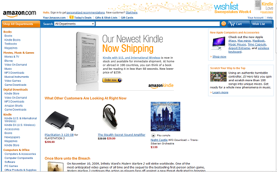
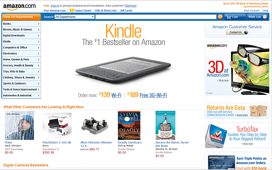
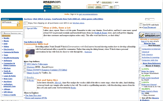
Take a look at these shots of the Amazon Web Site

Circa January 2001:

Amazon2001

Note how text heavy the site was. Since most folks were still dialing up to the Internet, it was important to have only a few pictures. Even the navigation was text heavy and designed to get you to a category quickly. Notice also the prominent search box in the upper left hand corner – some things haven’t change and the value and importance of search was well understood even back then.

Circa January 2010:
Amazon2009

Now we’ve got a lot more and larger graphics in order to showcase the products. Now the search bar is considerably longer. In all likelihood in the 10 years ago site, I would have only typed in one or two words. Now I’m comfortable typing in the whole title of a book or model of an item that I’m looking for and can see the whole thing in the search bar.

Amazon2011January 2011:

Looks pretty similar doesn’t it? Even the Kindle is prominently featured. Notice in both last year and this year how the immediacy of an experience things are. You can see what other customers are looking at RIGHT NOW. While there is more “stuff” in this year’s page, there is still a good use of white space to focus attention – that Kindle really stands out. Amazon has figured out though how to add more advertising on the right without overwhelming the page and they have tightened up the navigation on the left opting for pop-out menus instead of a longer listing of categories.

So what does this mean for you and your site?

First it means that if you haven’t changed your site in a few years, the time has come. It needs to be refreshed. Like your logo? Keep it. But consider what you want your site to do and then look at it and ask yourself if it is helping you do that? How can it be done better? Have you changed your services or products? Do you have something you should be featuring as prominently as Amazon features their Kindle?

Next it means you need to stay on top of (but not necessarily on the bleeding edge of) change. What is happening that will affect your business and your web site. When the automobile was first invented, how many blacksmith’s thought it was a passing fad? When the computer was invented how many typewriter makers thought it was just a flash in the pan? Don’t be left behind because you’re not staying on top of change.

It also means that some of the things you try might not work. Over the years Microsoft has had some spectacular failures (anyone remember Microsoft Bob?) but they continue to be a very powerful force because they try new things. Right now social media marketing is all the rage. Passing fancy? Who knows? The one thing I do know is that 100s of millions of users are out there so we’re engaging because that’s where our potential customers are.

If you want help changing your site, call EduCyber at 303 268-2245.

SHARE THIS:

Test Your Site across Browsers

When I worked in Tokyo (in the late 90’s) I remember looking at a web site affiliated with where I worked and it looked terrible. Worse than terrible. When I went to talk to the designer (this was not his job) I understood the problem even before we began to talk – he worked on a huge monitor (21 inch CRT) and the site looked great on his monitor and while using Internet Explorer.

The lesson I learned that day was the importance of testing a web site in a variety of browsers, resolutions and monitors.

There are more browsers out there than some realize. The main ones are Internet Explorer, Firefox, Chrome, Safari and Opera. When testing with Internet Explorer you get the joy of testing several different versions as well. The much despised Internet Explorer 6 has finally dropped in usage to the point where designers can design without all the goofy restraints that come with it.

So for Internet Explorer flavors, you should test with IE7 and IE8 and perhaps even the test version of IE9. Basically since the demise of IE6, you get a similar look no matter which version of IE you are using but it doesn’t hurt to check different ones to be sure.

With the other browsers, testing across different versions isn’t as important as making sure you at least take a look at the site with a current version of the browser. The vast majority of Firefox users are on version 3.6 so that would be a good one to test with (at least in January of 2011).

Chrome is an up and coming browser, primarily because it is a Google product. Between September of 2009 and September of 2010, Chrome nabbed about 8% of the browser market from Internet Explorer.

Safari and Opera account for 4.4% and 2.0% of browsers being used so it isn’t a bad idea to check in these browsers as well.

Except for multiple versions of IE, it is relatively easy to install and run these browsers, all within the same system – I’m writing this on a system with IE, Firefox, Chrome and Safari installed.

Other factors to check to make sure your web site displays correctly include testing it on different operating systems and testing it on handhelds. The biggest problem we’ve heard so far is about Apple’s decision not to support Flash. There goes your nice Flash presentation if you’re getting a lot of visitors using Apple’s iPad, iTouch or iPhone to view your site.

A little bit of testing can save you the embarrassment of having your site look like it was designed by a middle school student.

Need help making your site look right across browsers? Turn to EduCyber and we’ll help. Give us a call at (303) 268-2245.

SHARE THIS:

Measuring Up

What do you measure on your web site? Do you measure the number of hits? The number of unique visitors? The number of visits from search engines?
All of those might be useful to you. The key is to take in the big picture. It would be a shame to be ranked number 1 in the search engines for your key phrase and drive hundreds or thousands of visitors to your site but not get any business from it.
After all, aren’t we all in business to make money?
So when you measure, make sure that you measure throughout the funnel. How many calls or sales or submissions do you get through your web site? These are measurables that create direct contact with a potential customer. Once the web site has accomplished that, then it is up to you and your processes to close the deal.
So if you see that your web site traffic has doubled or tripled, or perhaps had a 20% increase, that should translate into an increased amount of direct contact measurables. If it hasn’t, it’s time to re-examine your site.
Now you will want to measure things like bounce rate and time on site to see what is and is not working. If your home page has a really high bounce rate, for example, then you need to look at what isn’t working on the home page. Is it difficult to navigate? Is it unclear what the next step is?
By evaluating what you’re measuring, you get the big picture and can make meaningful changes that will positively affect your bottom line.
During the cold war, the key US phrase was “Trust but Verify”. When it comes to your web site, the phrase should be “Measure but Evaluate”.

SHARE THIS:

Get Traction with Google Local

Local search is where it is at for service related companies. Whether your service is landscaping, roofing, dry-cleaning or computer support, it only makes sense that you would do most if not all of your business in and around your local community.

So how does local search work? While it can be quite complex to get your site listed high in the local listings, the basics are simple and sometimes that is enough.

Let’s use Google since they account for 84.72% of all search engine usage worldwide.

  1. First go to http://www.google.com/maps and in the search bar, type in the name of your company. If nothing comes up, type in your address.
  2. When you see your listing (there should only be one – if there are more, that’s a topic for another day) click on more info. Along the top on the right you’ll see a link that says “Business Owner?”. Click on that link and claim your listing.
    • If it says “Owner-verified listing” then someone from your company has already claimed the listing. You’ll need to talk to them to get more information.
  3. If you don’t have a Google account, it only takes a few minutes to create a verify one. Do this and come back to the maps. If you already have a Google account, then login.
  4. Now you’re ready to enter your company information. The more info you enter, the better your chances of being listed.
  5. Put in your complete address and ALL of your contact information.
  6. Choose two or more categories for your business.
  7. Enter your hours of operation as appropriate and check off the types of payment you accept.
  8. Upload a couple of pictures – of you, of the outside of your place of business, of the inside, etc.
  9. Upload a video or two. These don’t have to be professionally shot. Just practice a few times and take the best one you have. Introduce people to your business.
  10. Enter some additional details and click on Submit.
  11. The first time you do this, you will be asked to select whether Google should call you or mail you. Select call and be prepared to enter the PIN number they’ll give you on the phone as soon as you click Finish. Then within a day or two your listing will be eligible to begin appearing.

There are lots of things you can do to enhance your local listing such as:

  • Upload more pictures
  • Upload more videos
  • Add / Create fields for Additional Details
  • Add as many categories as you can think of for your listing
  • Try the free trial of Google Tags
  • Update your status
  • Create a coupon
SHARE THIS:

A Look Back, A Look Ahead

What did you measure this year? All of us measure the bottom line but what else? Did you measure the number of new customers / clients? What about number of leads and number of those leads that converted into clients? Number of sales online? Number of new newsletter signups? Number of fans or followers on social media?

How did your numbers measure up? Some interesting things we noticed in our numbers: With the year not yet finished, we’ve already had 16% more visitors to our site this year over last. An online store we manage has had a 5 fold increase in sales and a lot more traffic.

For our site our traffic from search engines is actually down a bit over last year but that is because we’ve been focusing on our customer’s campaigns more than our own so we’re not too upset over that one.

Whatever you measure, make sure it adds to your marketing goals. If our goal was to get a lot of traffic from the search engines, you can be sure we would have paid a lot more attention and performed a whole lot better.

For the year ahead (don’t give up on this one yet though – there are still almost three weeks left) take time to set out your Internet Marketing goals. Start with your web site itself. If it conversion optimized? That is, is your site ready to convert visitors into customers? If you want to measure newsletter signups, for example, is the site geared towards getting visitors to do that? Are there barriers that you may have inadvertently put in place (such as asking for a physical address when all you need is an email address)?

Typically you want to have a conversion and a micro-conversion. If they aren’t ready to buy from you or ask you for a quote, perhaps they’ll sign up for your newsletter so they can stay in touch. Asking for a quote would be the conversion and the newsletter signup, the micro-conversion.

Once your site is ready, you can look at other marketing venues. Do you need Pay Per Click? Would a local search campaign make sense for you? How does social media marketing fit into the picture? Should you be tweeting? Do you need to claim your business on Foursquare? Will using QR codes help you reach your goals?

If you’re not thinking about these questions, I would suggest that you ought to be. If you’re not but feel like you should, give EduCyber a call at 303 268-2245. We can help you plan for a fantastic year.

SHARE THIS:

Can’t do Business the Same Old Way

online poker news

During a meeting with a potential client this week I made a casual inquiry, asking which payment processor they currently used for the ecommerce web site.

“Oh, we do it manually” they said. It turns out they use an antiquated system that sends them the customer’s credit card information via email. They then take that information and run it through their Point of Sale software to charge the account.

Oops. That is a dangerous if not illegal procedure.

Emails, by their very nature, travel from computer to computer across the internet. There are ample opportunities for one of these relaying computers to cache a copy of the email, with the customer credit card information. This then creates an opportunity for the information to not be secure. If this data is encrypted, it is reasonably secure. If not, it is a ticking time bomb. I don’t want to be there when the ticking stops.

Once the email has arrived, a host of other security issues arise:

  • Is the network secure?
  • Is the computer secure?
  • What happens with the email after the transaction has been processed?
  • Was it printed out?
  • If it was printed out, what is done with the print out after the transaction has processed?

In Colorado it is, to my understanding, illegal to store a hard copy of the complete credit card number of a customer.

If you are a merchant and aren’t sure if your system is compliant, a good place to get started is https://www.pcisecuritystandards.org/merchants/.

Another valuable source is EduCyber Endorsed SGP Services. Give Sean a call at 303-697-7799.
 

SHARE THIS:

If the Queen can do it, so Should You

It really is time for you to get your business on to Facebook. How do I know this? The Queen of England now has her own Facebook page. Actually it is the British Monarchy but for all intents and purposes, that is the Queen.

You can do some of the many things the Queen is doing:

  • Show the world whatever you want about yourself – and being the British Monarchy, they don’t share a lot but what they do is out there for all to see.
  • Link to your Youtube account – who knew there was a Youtube account for the Queen? – and embed your videos in your Facebook page.
  • Link to your Twitter account – boy these stuffy royals sure know their Internet marketing
  • Link to your Flickr account so you can show off your pictures
  • Link to the prince’s web site. OK, so maybe there aren’t any princes associated with your business but you could link to key partners / vendors – in fact if this is done well it helps them and makes them look more kindly towards you.

If a “business” run by an 84 year old lady can get this engaged in Social Media in order to facilitate relationships and build up a public image, why shouldn’t you?

SHARE THIS:

We are proud members of many community organizations and chambers. See Our Community Involvement.

©1998-2024 EduCyber - All rights reserved. | 4251 Kipling Street, Suite 340 Wheat Ridge, CO 80033 USA | info@educyber.com